Scale and Visualize qPCR results
Otho Mantegazza
2018-12-05
scale-plot.RmdHere, you will learn how to scale, inspect and visualize the gene expression data that you have parsed in the previous vignette (Load and Normalize the qPCR Output).
Setup
library(fluidgr)
library(magrittr)
library(dplyr)
library(stringr)
library(ggplot2)
library(forcats)
library(scales)
library(devtools)
Data
We provide the fluidigm_expr object, that contains normalized gene expression measurement.
This object is exactly the same at the one produced in the vignette (Load and Normalize the qPCR Output).
You can load it by just typing fluidigm_expr:
fluidigm_expr
#> # A tibble: 240 x 7
#>    sample_name sample_type target_name target_type ct_value norm_geom_mean
#>    <chr>       <chr>       <chr>       <chr>          <dbl>          <dbl>
#>  1 J-N2R3      Unknown     gene1       Test            5.79           6.57
#>  2 J-N2R3      Unknown     gene4       Test           15.0            6.57
#>  3 J-N2R3      Unknown     gene2       Test            9.60           6.57
#>  4 J-N2R3      Unknown     gene3       Test            9.52           6.57
#>  5 J-N2R2      Unknown     gene1       Test            5.92           6.46
#>  6 J-N2R2      Unknown     gene4       Test           16.8            6.46
#>  7 J-N2R2      Unknown     gene2       Test            9.27           6.46
#>  8 J-N2R2      Unknown     gene3       Test            8.83           6.46
#>  9 J-N2R1      Unknown     gene1       Test            5.53           5.76
#> 10 J-N2R1      Unknown     gene4       Test           16.4            5.76
#> # ... with 230 more rows, and 1 more variable: expression <dbl>
Exploratory Data Analysis: Scale and Visualize
When we explore medium sized gene expression datasets, such as the one produced by qPCR, we often just concentrate on statistical testing and statistical relevance. But in this kind of datasets, you can observe many gene expression patterns and behaviour by Exploratory Data Analysis, when you iteratively scale and plot your data.
Scaling and plotting are tightly connected, because plots can help you figure out how scaling transforms your expression data; and appropriate scaling can help you detect useful expression patterns in your plots.
What variables are in your data?
Make the variables in your data explicit.
Often medium sized qPCR gene expression measurememtns are multivatiate. If you want to visualizalize them effectively, make all variables explicit. Also, keep in mind which variable you suspect that determines the response in your dataset and eventually what is the question that you are trying to anwser.
For example in the sample dataset we are measuring the expression of four genes in 4 developmental stages in 5 species. The column target_name records the “gene” variable, while the other two variables, developmental stage and species, are hidden in the sample_name variable. We can make them explicit.
The sample_name variable is encoded as “J-N1R1”:
- The first letter “J” is the species.
- The letter and the number after the hyphen “N1” encode for the stage.
- The last letter and number “R1” encode for the replicate.
# make variable explicit
fluidigm_expr <-
  fluidigm_expr %>%
  # make species explicit
  mutate(species = str_split_fixed(string = sample_name,
                                   pattern = "-",
                                   n = 2)[, 1]) %>%
  # make stage explicit
  mutate(stage = str_sub(string = sample_name,
                         start = 3,
                         end = 4)) %>%
  # make replicate explicit
  mutate(replicate = str_sub(string = sample_name,
                         start = 5,
                         end = 6))
Scale your data
When you want want to explore gene expression, scaling is not always necessary, and often you can use, explore, visualize and communicate directly the normalized expression values; stored in the expression column of the fluidigm_expr dataset.
Indeed scaling is not always necessary, but, together with exploratory plots, scaling can help you detect patterns in your data.
Exploratory plots can help understand the effect that scaling has on expression data. This is why we explain scaling and visualisation of expression data together.
Scale with the scale_fluidigm() function
Fluidgr provides the scale_fluidigm() function, that scales expression values:
- by z-score in one column (
scaled_expression), - in range 0 to 1 in another(
scaled_01_expression),
according to the groups provided in the argument .group.
This function takes as input the output of normalize() and returns the same dataset with the two extra column scaled_expression.
scaled_dat <-
  fluidigm_expr %>%
  scale_fluidigm(.group = target_name)

# inspect the output
scaled_dat %>% select(scaled_expression, scaled_01_expression) %>% summary()
#> Adding missing grouping variables: `target_name`
#>  target_name        scaled_expression scaled_01_expression
#>  Length:240         Min.   :-2.0959   Min.   :0.000000
#>  Class :character   1st Qu.:-0.5954   1st Qu.:0.006373
#>  Mode  :character   Median :-0.4200   Median :0.175943
#>                     Mean   : 0.0000   Mean   :0.232264
#>                     3rd Qu.: 0.3937   3rd Qu.:0.389738
#>                     Max.   : 4.6191   Max.   :1.000000
Write your own scaling function
You can write your own scaling function, becaus scale_fluidigm() function is just a soft wrapper around dplyr’s group_by() and mutate(). If you want to try different scaling methods, you can replicate and tweak the output of scale_fluidigm() with:
This should provide to you a good basis and enough freedom to explore and visualize your data as you prefer.
Visualize
Fluidigmr does not provide plotting function, because all the functions that you need to plot this kind of data are already available in ggplot2. Indeed the dataset output of is already in a tidy/gathered format.
Here we provide some ideas of how you can explore, plot and visualize your Fluidigm data.
Lineplot
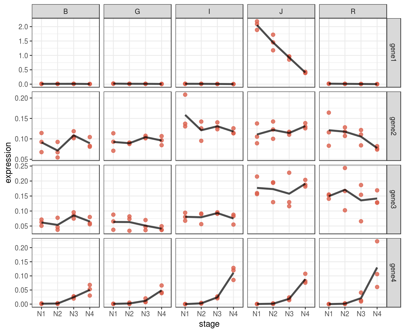
A lineplot can be informative directly on normalized data, without scaling.
You can use facets to display multivariate data.
p <- fluidigm_expr %>%
  ggplot(aes(x = stage,
             y = expression)) +
  # plot each expression value into a point
  geom_point(size = 2,
               col = "#DA614D",
               alpha = .8) +
  # it might be complicated to add a line that connect means
  # across stages,
  # because stages are encoded as a categorical variable,
  # we must turn them into numeric
  stat_summary(aes(x = stage %>%
                     as.factor(.) %>%
                     as.numeric(.)),
               fun.y = mean,
               geom="line",
               size = 1.2,
               alpha = .7,
               linejoin = "round") +
  # implement facetting with independent y values
  # for each genes, since expression values are
  # not comparable across genes
  facet_grid(target_name ~ species,
               scales = "free_y") +
  theme_bw()

p %>% print()
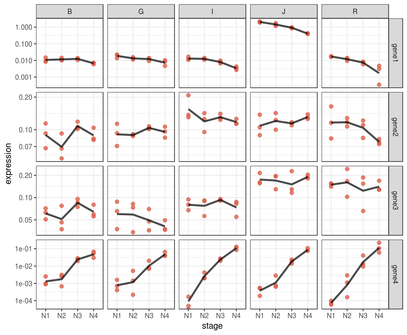
Some patterns in your data might be more evident if you plot them in log scale.
p_log <-
  p + scale_y_log10()

p_log %>% print()
Also using heatmap with ggplot2
p_heat <-
  fluidigm_expr %>%
  ggplot(aes(x = stage,
             y = target_name,
             fill = expression)) +
  geom_tile() +
  facet_grid(. ~ species) +
  scale_fill_viridis_c()

p_heat %>% print()
Heatmaps
Sometime heatmap don’t convey muich invormation if you don’t scale your data.
For example we can scale every gene on z-score to make them comparable.
scaled_gene <-
  fluidigm_expr %>%
  group_by(target_name) %>%
  mutate(scaled_expression = expression %>%
           rescale(from = range(.), to = c(0,1)))
Check if the heatmap has improved
remeber to map the colours to the new scaled_expression values
p_heat <-
  scaled_gene %>%
  ggplot(aes(x = stage,
             y = species,
             fill = scaled_expression)) +
  geom_tile() +
  facet_grid(. ~ target_name) +
  scale_fill_viridis_c()

p_heat %>% print()
We can try to set more groups.
scaled_dat <-
  fluidigm_expr %>%
  group_by(target_name, species) %>%
  mutate(scaled_expression = expression %>%
           rescale(from = range(.), to = c(0,1)))
Check if the heatmap has improved
remeber to map the colours to the new scaled_expression values
p_heat <-
  scaled_dat %>%
  ggplot(aes(x = stage,
             y = species,
             fill = scaled_expression)) +
  geom_tile() +
  facet_grid(. ~ target_name) +
  scale_fill_viridis_c()

p_heat %>% print()